1 pertemuan 02 penyajian data dan distribusi frekuensi matakuliah: i0134 – metode statistika...
Post on 22-Dec-2015
257 views
TRANSCRIPT
1
Pertemuan 02Penyajian Data dan Distribusi
Frekuensi
Matakuliah : I0134 – Metode Statistika
Tahun : 2007

2
Learning OutcomesPada akhir pertemuan ini, diharapkan mahasiswa akan mampu :
• Mahasiswa akan dapat menjelaskan ukuran pemusatan, penyebaran dan data pencilan.
3
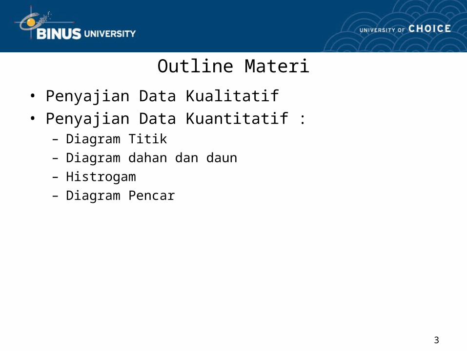
Outline Materi
• Penyajian Data Kualitatif• Penyajian Data Kuantitatif :
– Diagram Titik– Diagram dahan dan daun– Histrogam– Diagram Pencar
4
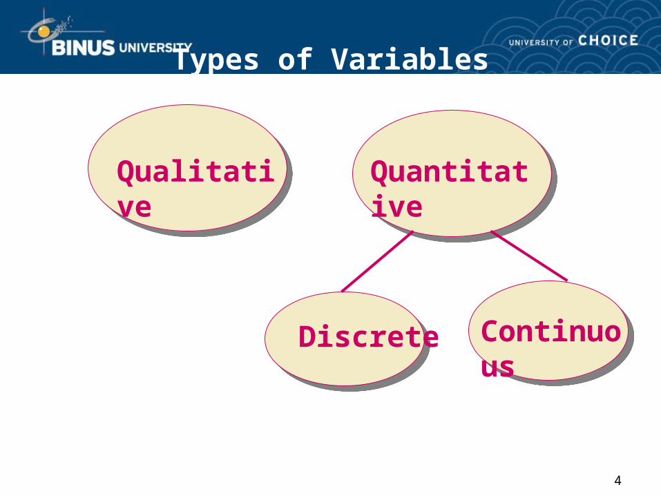
Types of Variables
Qualitative Quantitative
Discrete Continuous
5
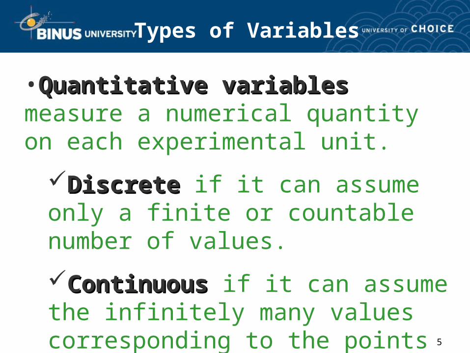
Types of Variables
•Quantitative variablesQuantitative variables measure a numerical quantity on each experimental unit.
Discrete Discrete if it can assume only a finite or countable number of values.
Continuous Continuous if it can assume the infinitely many values corresponding to the points on a line interval.
6
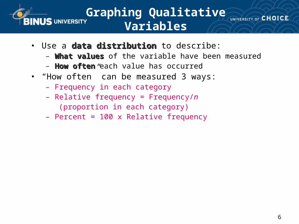
Graphing Qualitative Variables
• Use a data distributiondata distribution to describe:– What valuesWhat values of the variable have been measured– How oftenHow often each value has occurred
• “How often” can be measured 3 ways:– Frequency in each category– Relative frequency = Frequency/n (proportion in each category)– Percent = 100 x Relative frequency
7
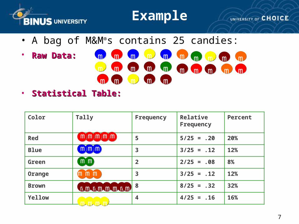
Example
• A bag of M&M®s contains 25 candies:• Raw Data:Raw Data:
• Statistical Table:Statistical Table:
Color Tally Frequency Relative Frequency
Percent
Red 5 5/25 = .20 20%
Blue 3 3/25 = .12 12%
Green 2 2/25 = .08 8%
Orange 3 3/25 = .12 12%
Brown 8 8/25 = .32 32%
Yellow 4 4/25 = .16 16%
m
m
m
mm
mm
m
m mm
m
mm m
m
m m
mmmm
mmm
m
m
m
m
m
m
mmmm
mm
m
m m
m mm m m mm
m m m
8
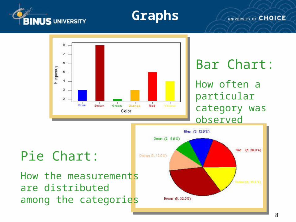
Graphs
Bar Chart:
How often a particular category was observed
Pie Chart:
How the measurements are distributed among the categories
9
Graphing Quantitative Variables
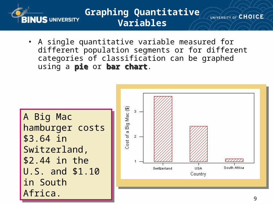
• A single quantitative variable measured for different population segments or for different categories of classification can be graphed using a pie pie or bar chartbar chart.
A Big Mac hamburger costs $3.64 in Switzerland, $2.44 in the U.S. and $1.10 in South Africa.
A Big Mac hamburger costs $3.64 in Switzerland, $2.44 in the U.S. and $1.10 in South Africa.
10
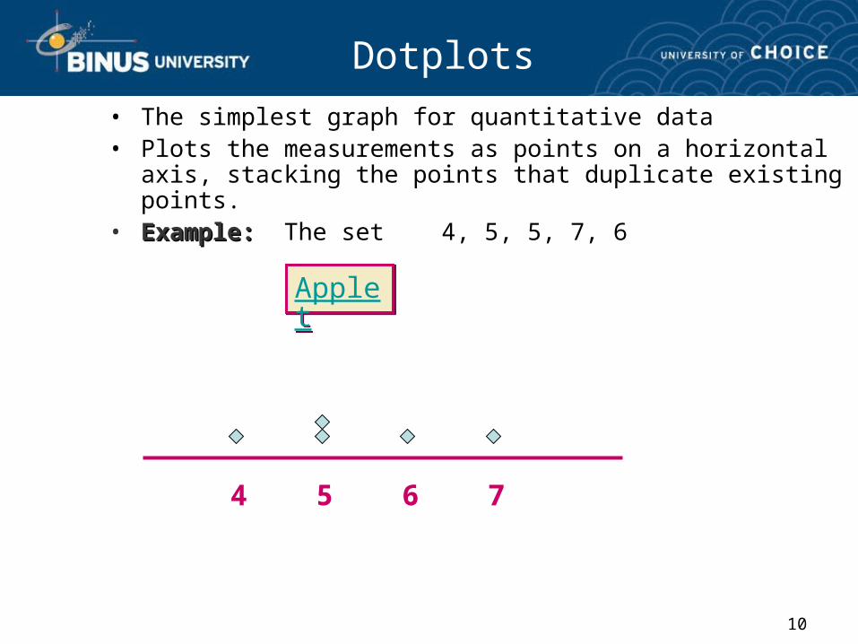
Dotplots• The simplest graph for quantitative data• Plots the measurements as points on a horizontal axis,
stacking the points that duplicate existing points.• Example:Example: The set 4, 5, 5, 7, 6
4 5 6 7
AppletApplet
11
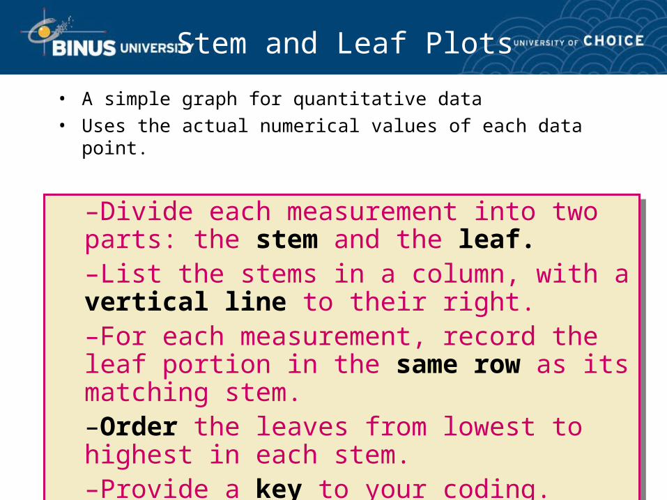
Stem and Leaf Plots
• A simple graph for quantitative data • Uses the actual numerical values of each data point.
–Divide each measurement into two parts: the stem and the leaf.–List the stems in a column, with a vertical line to their right.–For each measurement, record the leaf portion in the same row as its matching stem.–Order the leaves from lowest to highest in each stem.–Provide a key to your coding.
–Divide each measurement into two parts: the stem and the leaf.–List the stems in a column, with a vertical line to their right.–For each measurement, record the leaf portion in the same row as its matching stem.–Order the leaves from lowest to highest in each stem.–Provide a key to your coding.
12
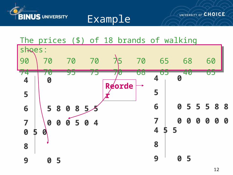
Example
The prices ($) of 18 brands of walking shoes:
90 70 70 70 75 70 65 68 60
74 70 95 75 70 68 65 40 65
4 0
5
6 5 8 0 8 5 5
7 0 0 0 5 0 4 0 5 0
8
9 0 5
4 0
5
6 0 5 5 5 8 8
7 0 0 0 0 0 0 4 5 5
8
9 0 5
Reorder
13
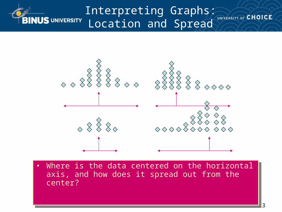
Interpreting Graphs:Location and Spread
• Where is the data centered on the horizontal axis, and how does it spread out from the center?
• Where is the data centered on the horizontal axis, and how does it spread out from the center?
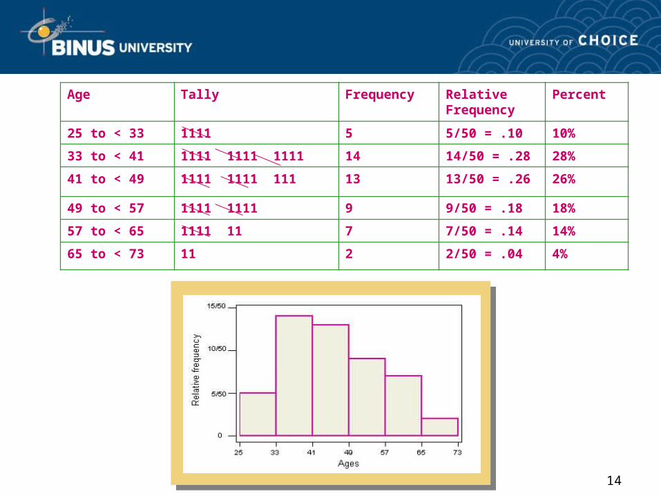
14
Age Tally Frequency Relative Frequency
Percent
25 to < 33 1111 5 5/50 = .10 10%
33 to < 41 1111 1111 1111 14 14/50 = .28 28%
41 to < 49 1111 1111 111 13 13/50 = .26 26%
49 to < 57 1111 1111 9 9/50 = .18 18%
57 to < 65 1111 11 7 7/50 = .14 14%
65 to < 73 11 2 2/50 = .04 4%
15
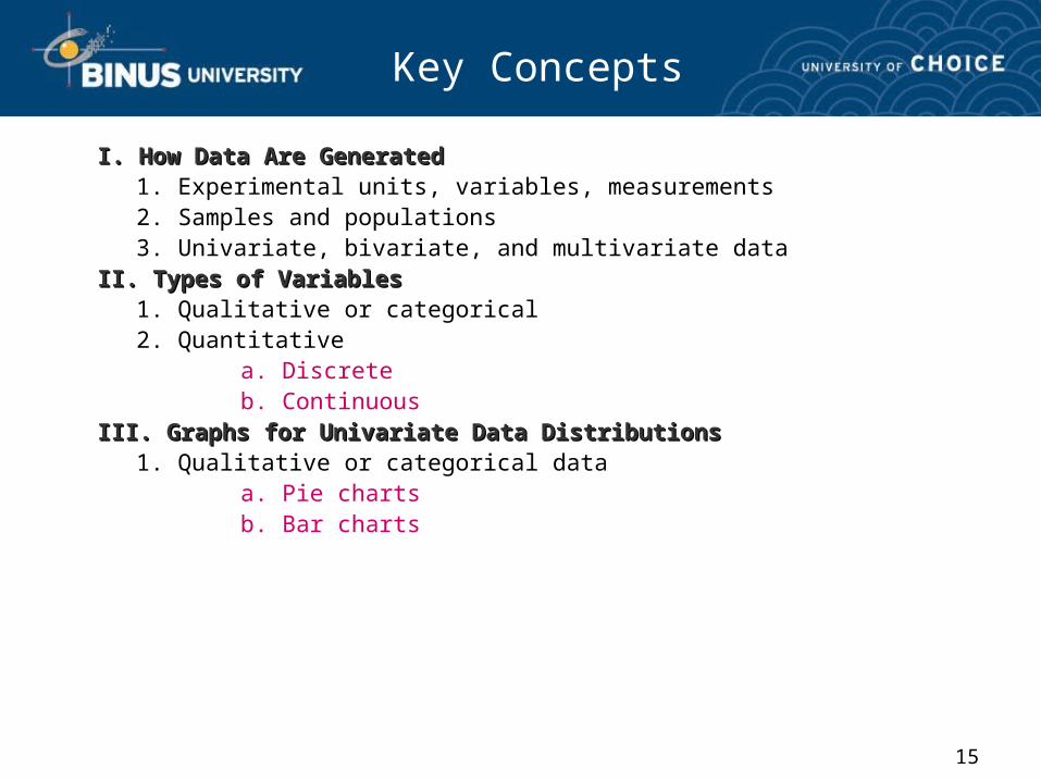
Key Concepts
I. How Data Are GeneratedI. How Data Are Generated1. Experimental units, variables, measurements2. Samples and populations3. Univariate, bivariate, and multivariate data
II. Types of VariablesII. Types of Variables1. Qualitative or categorical2. Quantitative
a. Discreteb. Continuous
III. Graphs for Univariate Data DistributionsIII. Graphs for Univariate Data Distributions1. Qualitative or categorical data
a. Pie chartsb. Bar charts
16
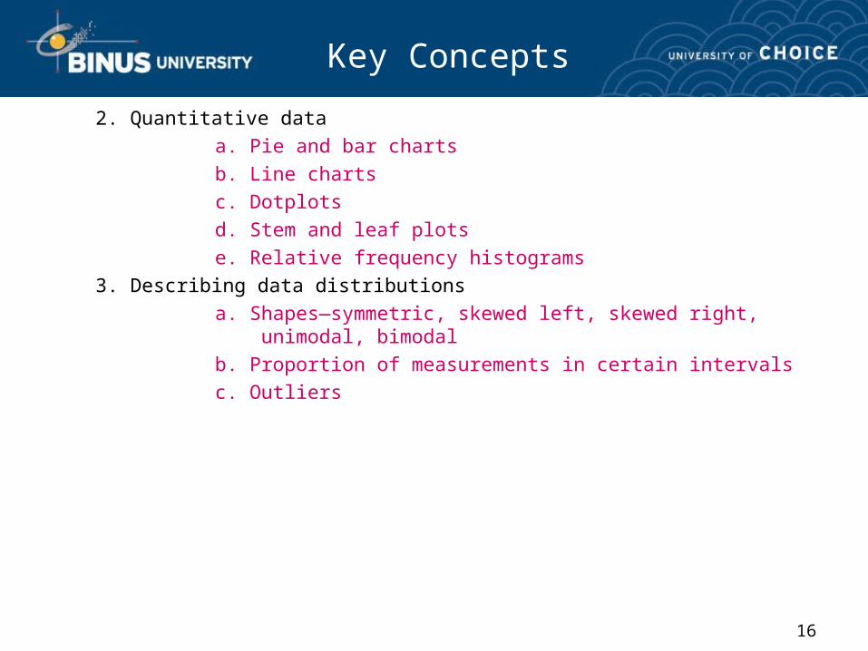
Key Concepts
2. Quantitative dataa. Pie and bar chartsb. Line chartsc. Dotplotsd. Stem and leaf plotse. Relative frequency histograms
3. Describing data distributionsa. Shapes—symmetric, skewed left, skewed right, unimodal, bimodalb. Proportion of measurements in certain intervalsc. Outliers

17
• Selamat Belajar Semoga Sukses.