materi 02 tipografi dalam dp
DESCRIPTION
ÂTRANSCRIPT
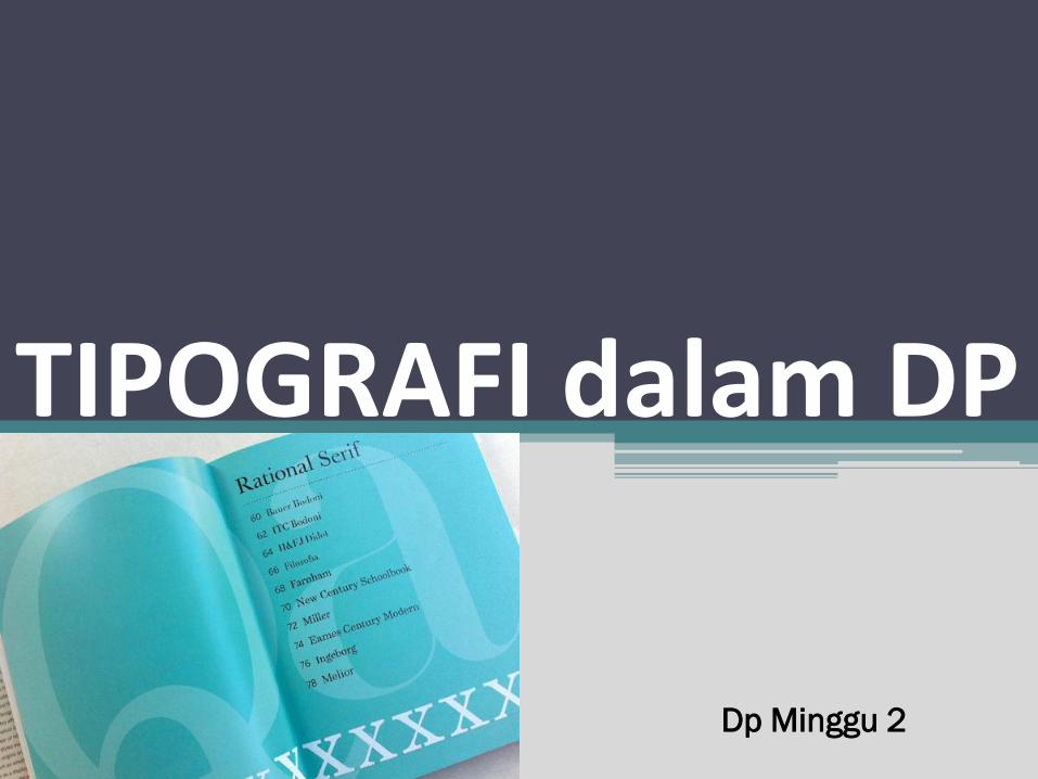
Dp Minggu 2
TIPOGRAFI dalam DP
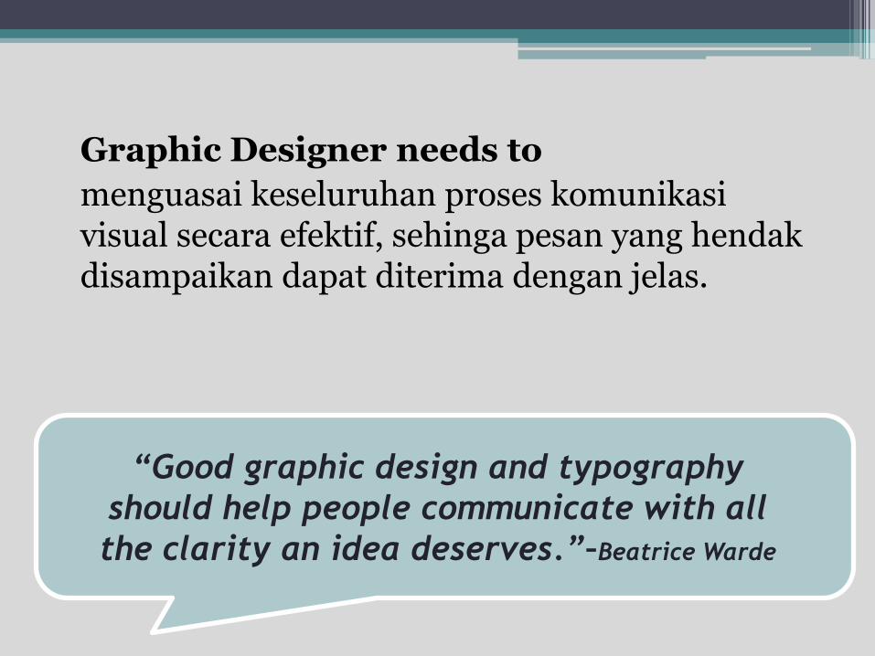
“Good graphic design and typography
should help people communicate with all
the clarity an idea deserves.”–Beatrice Warde
Graphic Designer needs to
menguasai keseluruhan proses komunikasi visual secara efektif, sehinga pesan yang hendak disampaikan dapat diterima dengan jelas.
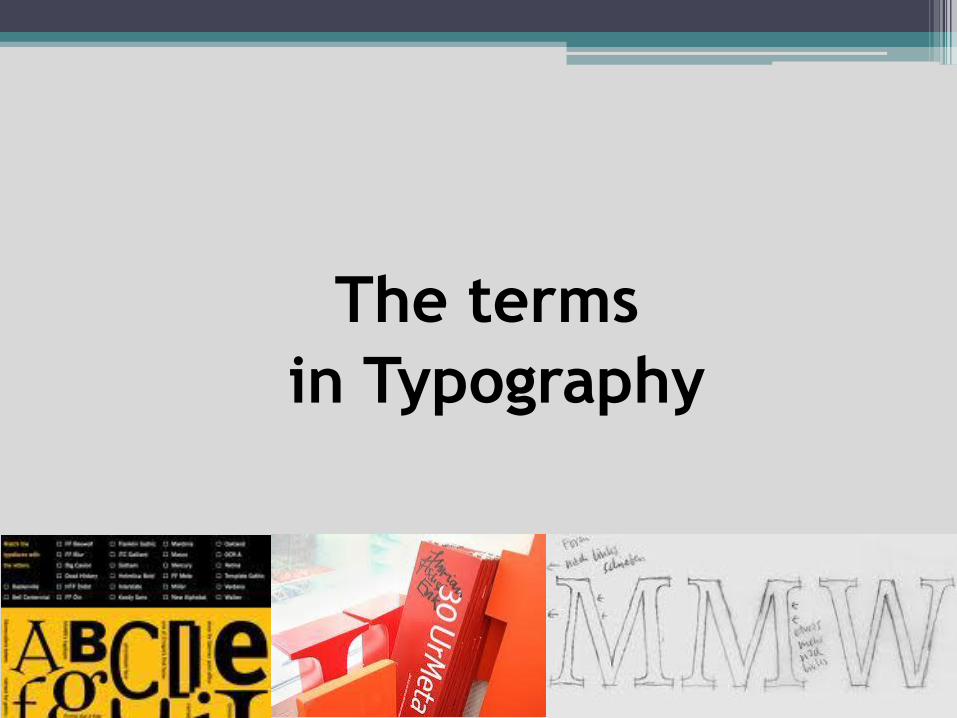
The terms
in Typography
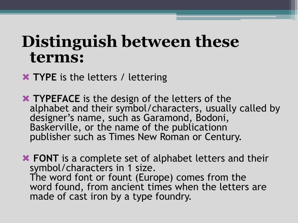
Distinguish between these terms: TYPE is the letters / lettering
TYPEFACE is the design of the letters of the alphabet and their symbol/characters, usually called by designer’s name, such as Garamond, Bodoni, Baskerville, or the name of the publicationnpublisher such as Times New Roman or Century.
FONT is a complete set of alphabet letters and their symbol/characters in 1 size.The word font or fount (Europe) comes from the word found, from ancient times when the letters are made of cast iron by a type foundry.
The term "font" and "typeface" has become ambiguous from its original sense, because in a design there are often different settings of font for each font size.
This confusion further excelled after the menu in the computer programs showed the variety of typeface available with the menu label "font“. We accept this, and use the term "font“ or "typeface" does not matter, as long as we understand why there are these 2 terms.
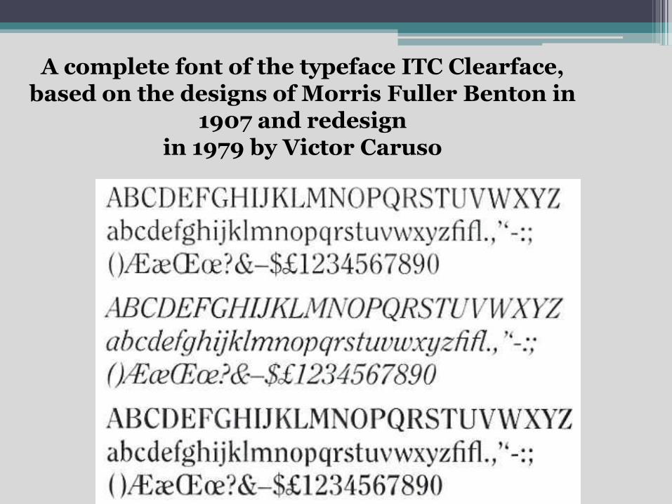
A complete font of the typeface ITC Clearface, based on the designs of Morris Fuller Benton in
1907 and redesignin 1979 by Victor Caruso
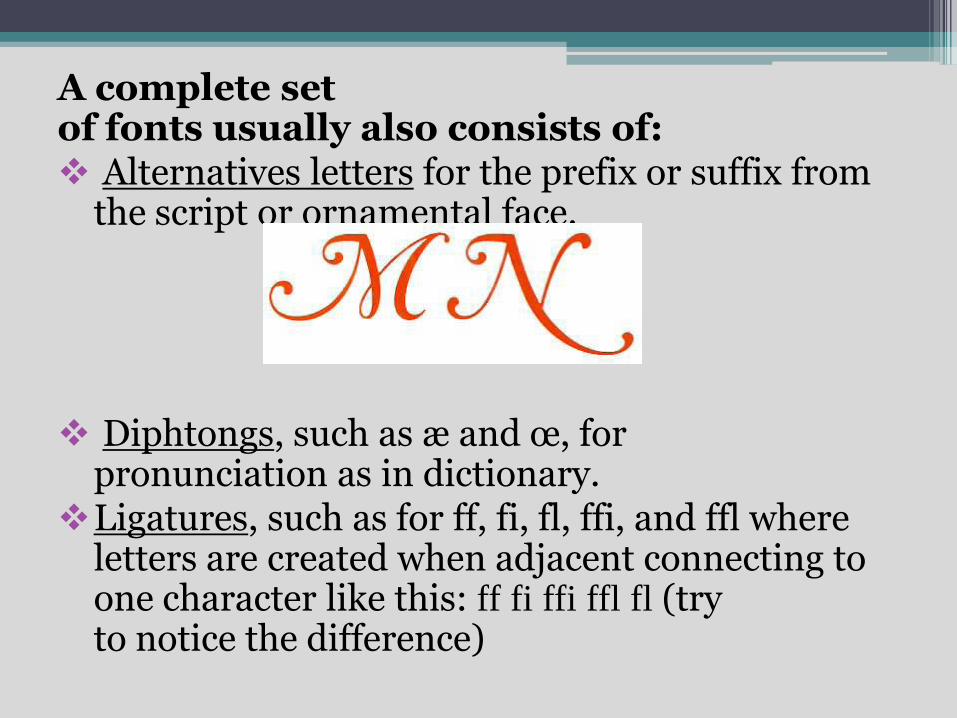
A complete set of fonts usually also consists of: Alternatives letters for the prefix or suffix from
the script or ornamental face.
Diphtongs, such as æ and œ, for pronunciation as in dictionary.
Ligatures, such as for ff, fi, fl, ffi, and ffl where letters are created when adjacent connecting to one character like this: ff fi ffi ffl fl (try to notice the difference)
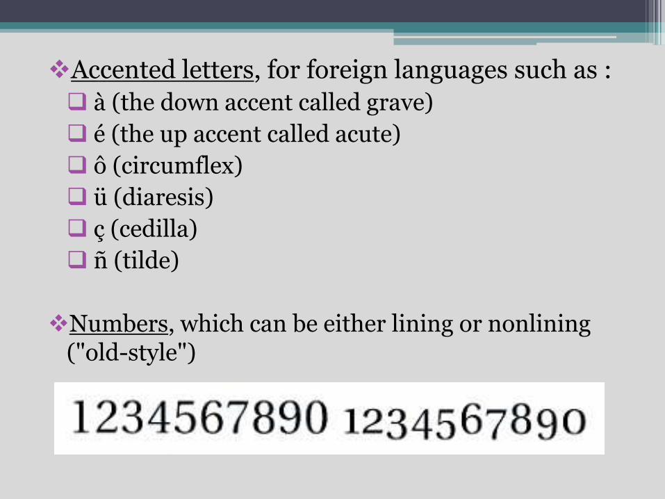
Accented letters, for foreign languages such as :
à (the down accent called grave)
é (the up accent called acute)
ô (circumflex)
ü (diaresis)
ç (cedilla)
ñ (tilde)
Numbers, which can be either lining or nonlining("old-style")
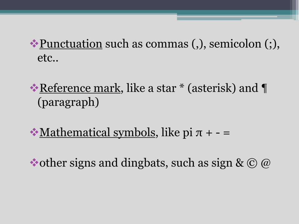
Punctuation such as commas (,), semicolon (;), etc..
Reference mark, like a star * (asterisk) and ¶(paragraph)
Mathematical symbols, like pi π + - =
other signs and dingbats, such as sign & © @
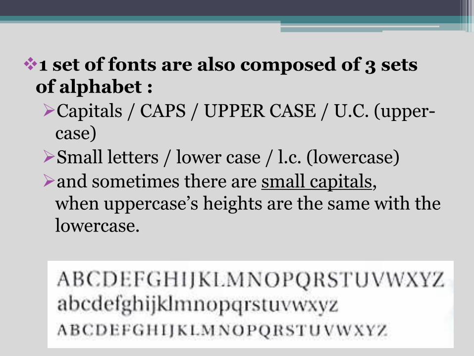
1 set of fonts are also composed of 3 sets of alphabet :
Capitals / CAPS / UPPER CASE / U.C. (upper-case)
Small letters / lower case / l.c. (lowercase)
and sometimes there are small capitals, when uppercase’s heights are the same with the lowercase.
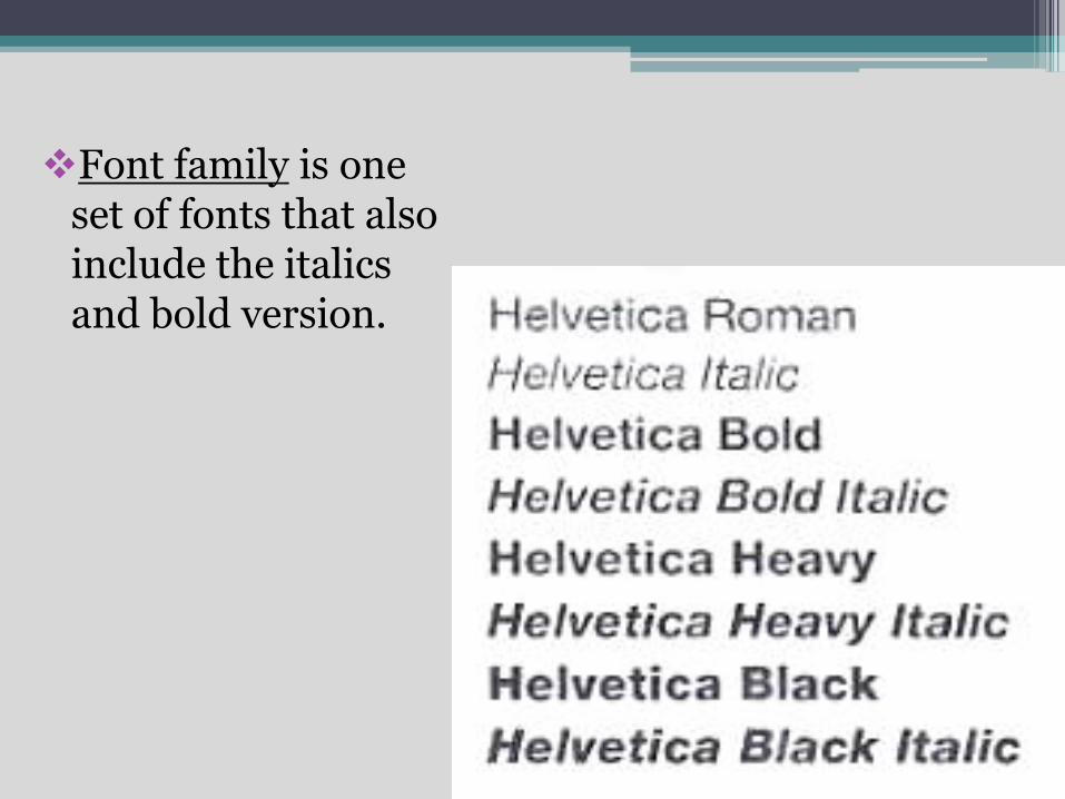
Font family is oneset of fonts that alsoinclude the italics and bold version.
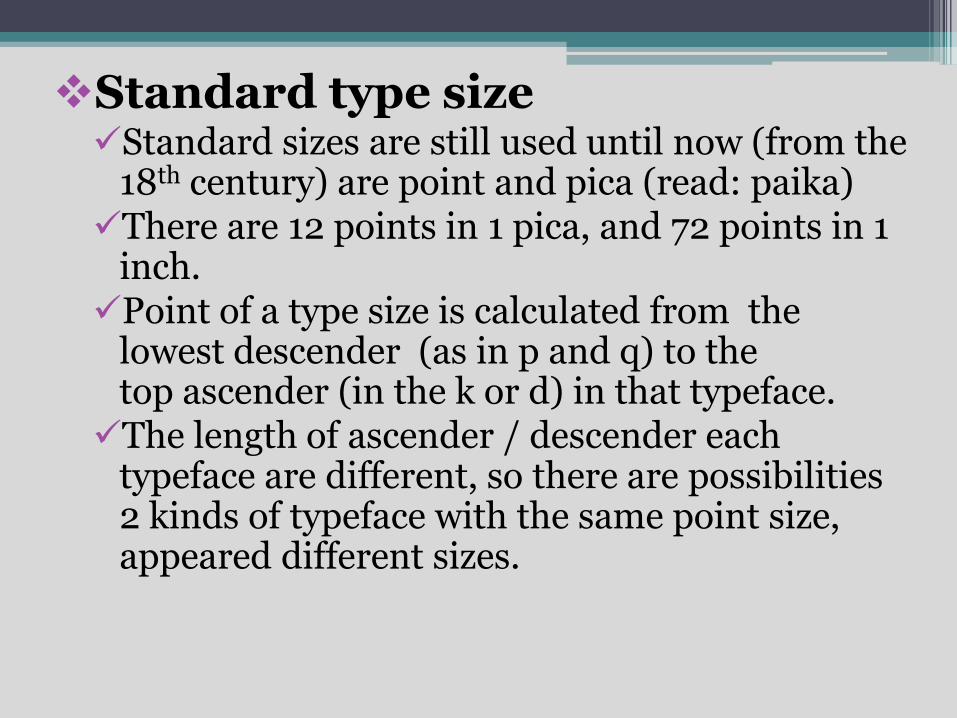
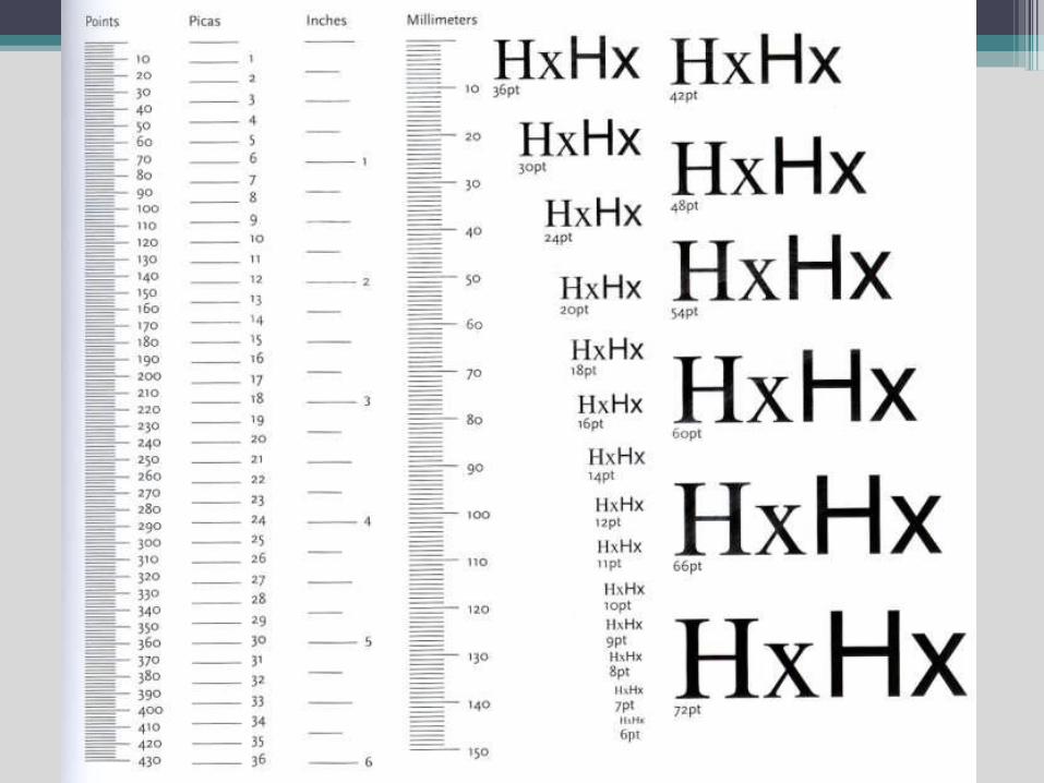
Standard type sizeStandard sizes are still used until now (from the
18th century) are point and pica (read: paika)There are 12 points in 1 pica, and 72 points in 1
inch.Point of a type size is calculated from the
lowest descender (as in p and q) to the top ascender (in the k or d) in that typeface.The length of ascender / descender each
typeface are different, so there are possibilities 2 kinds of typeface with the same point size, appeared different sizes.
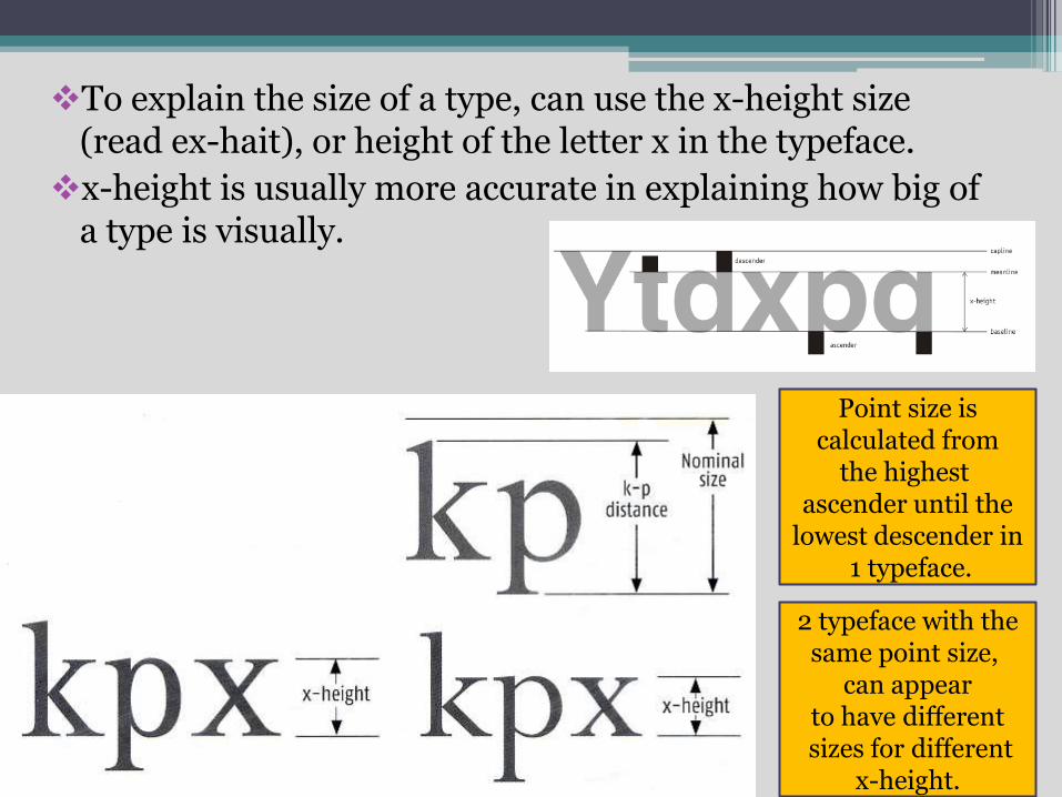
To explain the size of a type, can use the x-height size (read ex-hait), or height of the letter x in the typeface.
x-height is usually more accurate in explaining how big of a type is visually.
Point size is calculated from
the highestascender until the
lowest descender in1 typeface.
2 typeface with the same point size,
can appear to have differentsizes for different
x-height.
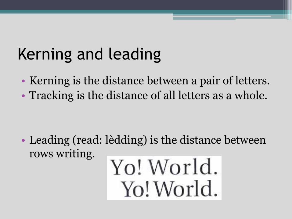
Kerning and leading
• Kerning is the distance between a pair of letters.
• Tracking is the distance of all letters as a whole.
• Leading (read: lèdding) is the distance between rows writing.
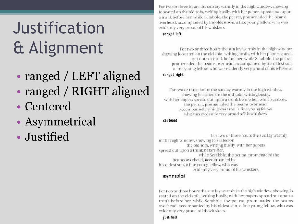
Justification
& Alignment
• ranged / LEFT aligned
• ranged / RIGHT aligned
• Centered
• Asymmetrical
• Justified
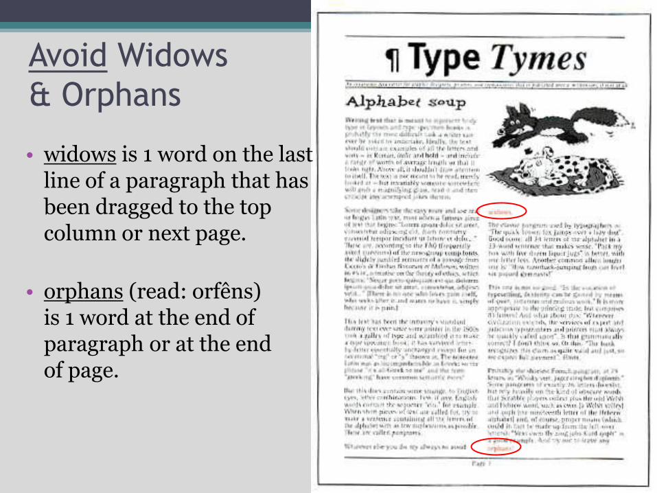
Avoid Widows
& Orphans
• widows is 1 word on the last line of a paragraph that has been dragged to the top column or next page.
• orphans (read: orfêns) is 1 word at the end ofparagraph or at the endof page.
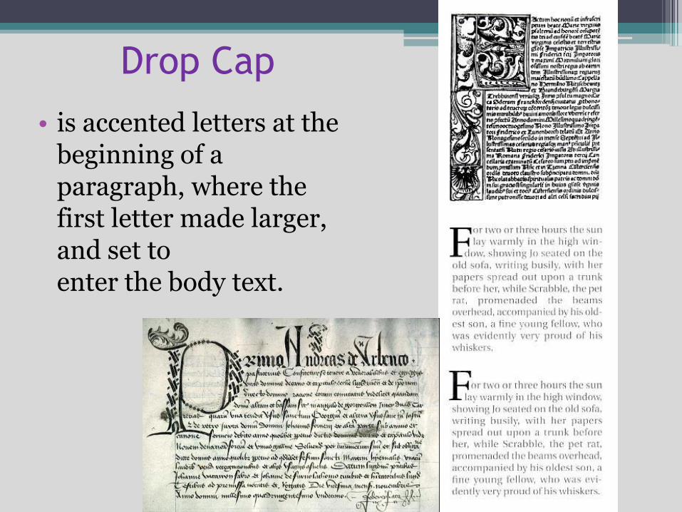
Drop Cap
• is accented letters at the beginning of a paragraph, where the first letter made larger, and set to enter the body text.
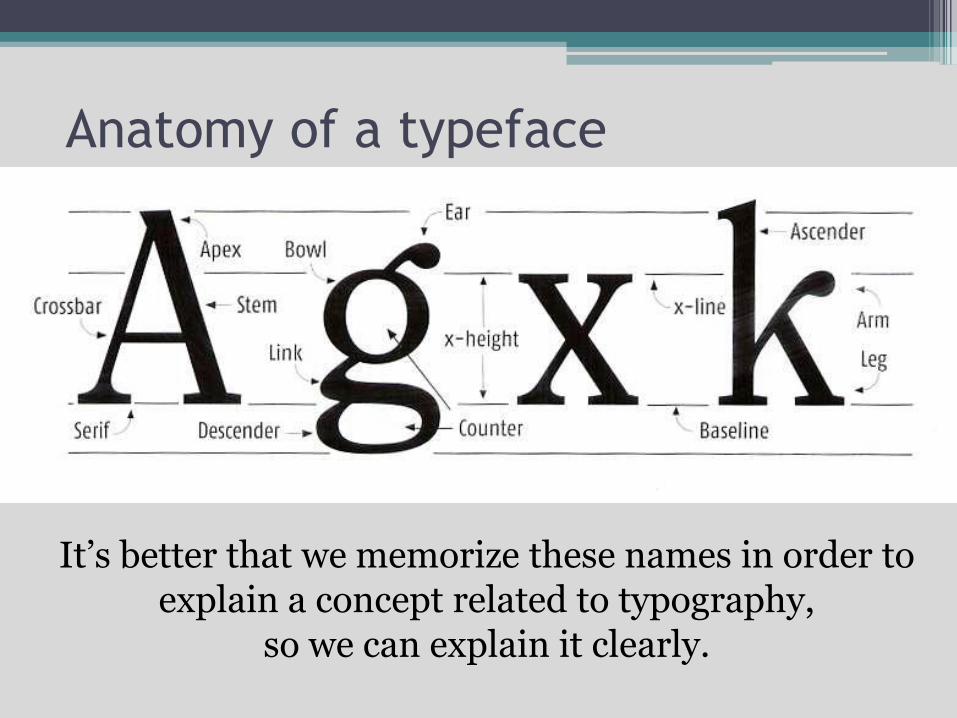
Anatomy of a typeface
It’s better that we memorize these names in order to explain a concept related to typography,
so we can explain it clearly.
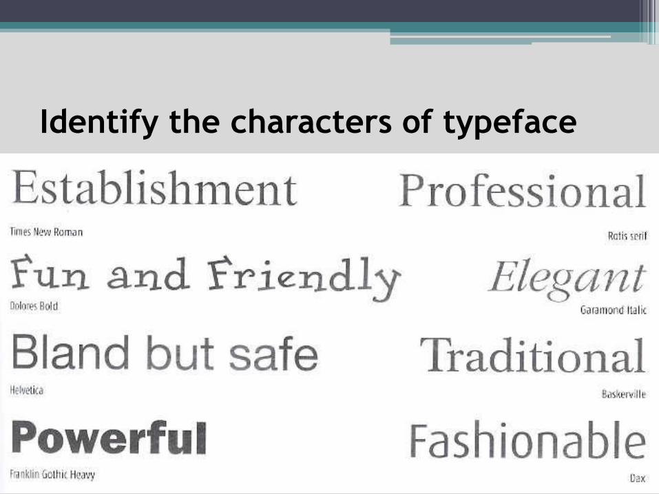
Identify the characters of typeface
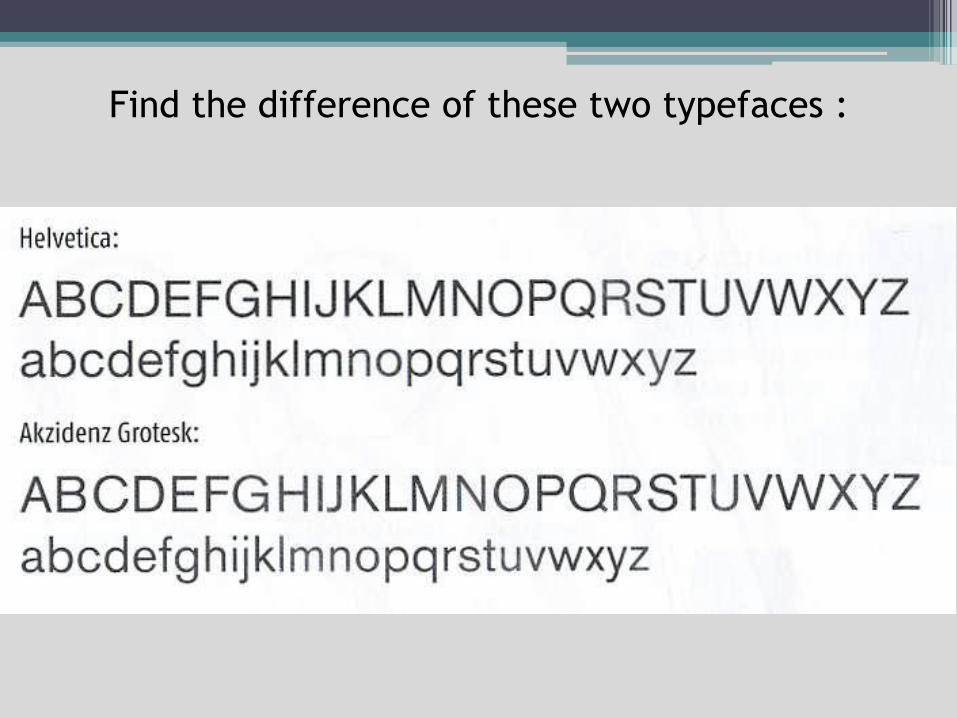
Find the difference of these two typefaces :
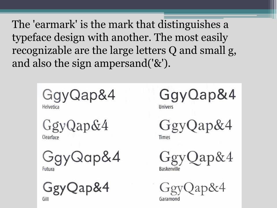
The 'earmark' is the mark that distinguishes a typeface design with another. The most easily recognizable are the large letters Q and small g, and also the sign ampersand('&').
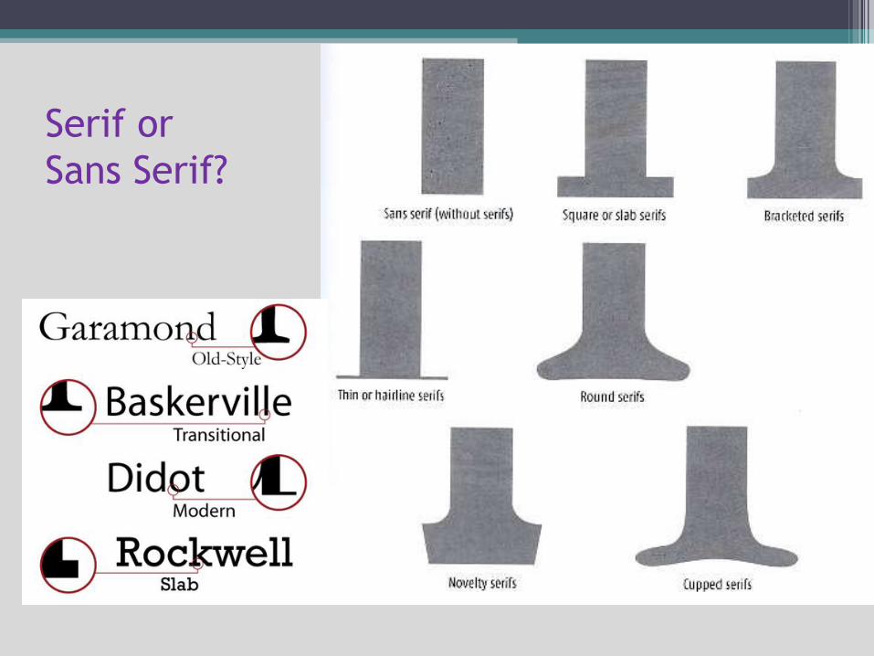
Serif or
Sans Serif?
Legibility and Readability
• The main purpose of the use of type in graphic design is to send a message efficiently.
• The legibility or readability of a text is very important.
• Type for the logo with type for the article’s body copy have a difference in application.
• There is a research about which is more Legible between serif or sans serif ...
• ... The results of the studies say that a serif typeface is easier to read continuously for a long time.
• Serif has several functions, to keep the distance between letters and also to link the letters to form the words.
Black on white, are also considered more Legible than white on black
Be careful, sometimes there are typefaces that consist of some type that looks the same as single digits, lowercase L, uppercase I, and between i and j, as in Futura.
Readability is whether the reading that has been written is interesting enough so the readers want to read it more.
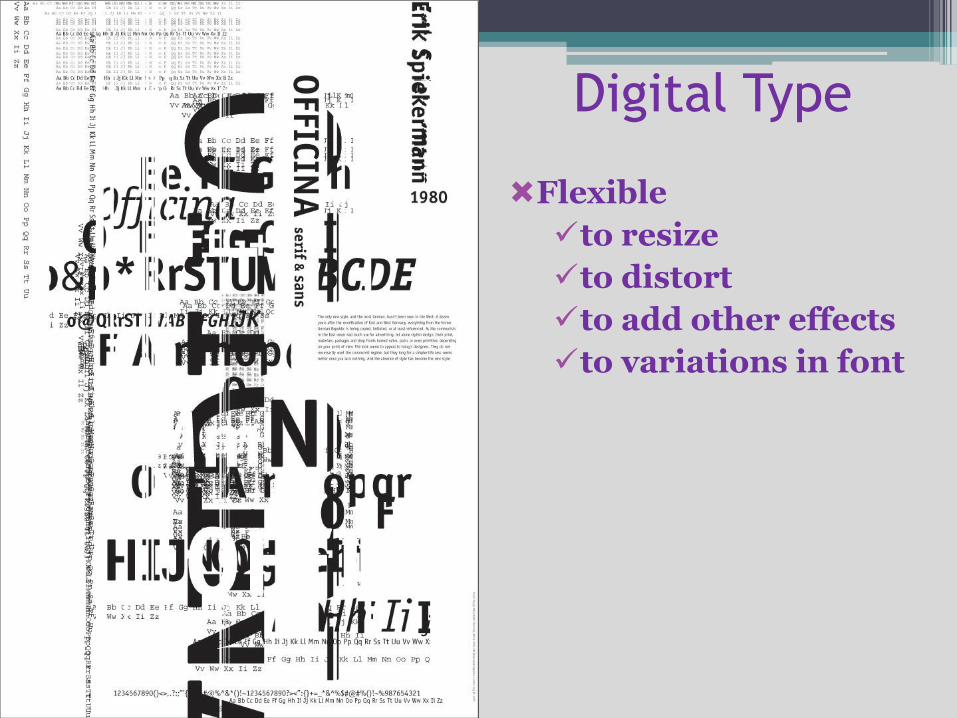
Digital Type
Flexible
to resize
to distort
to add other effects
to variations in font
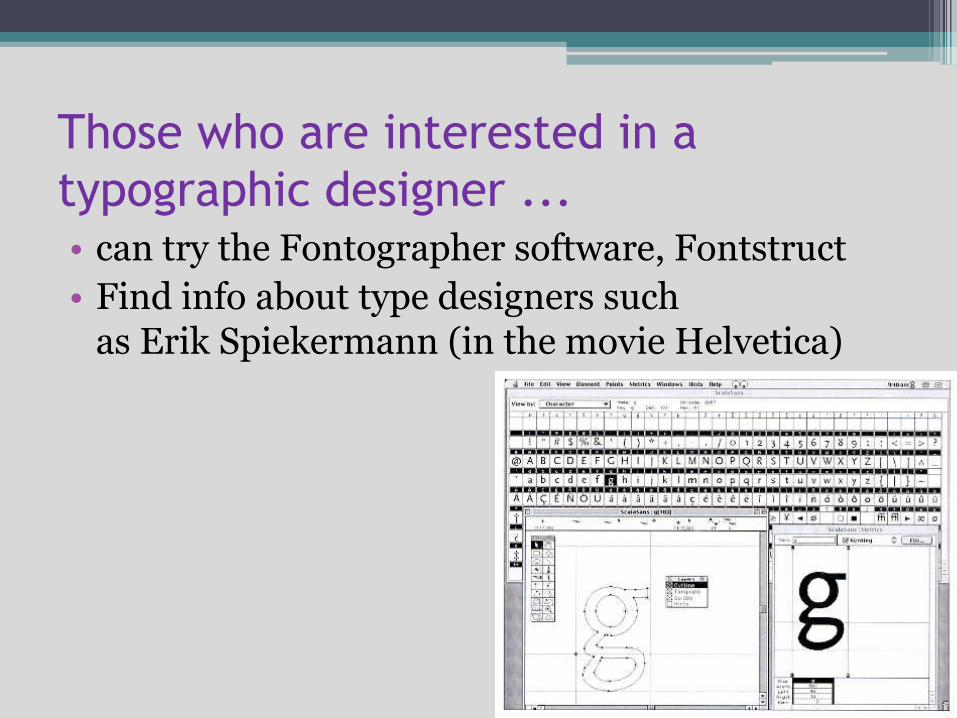
Those who are interested in a
typographic designer ...• can try the Fontographer software, Fontstruct
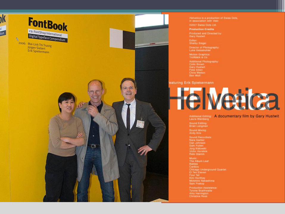
• Find info about type designers such as Erik Spiekermann (in the movie Helvetica)
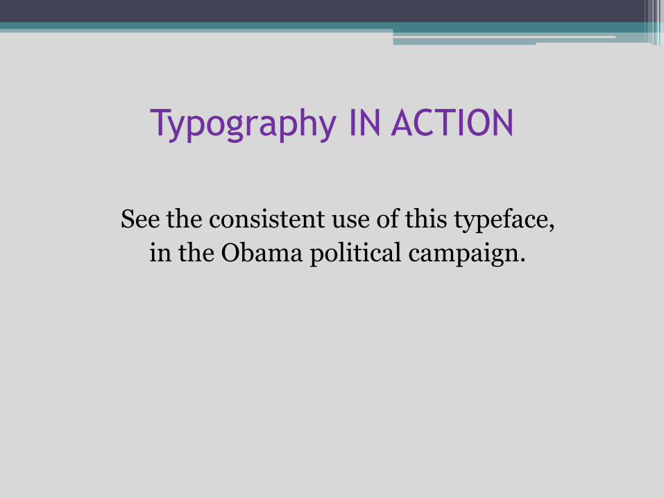
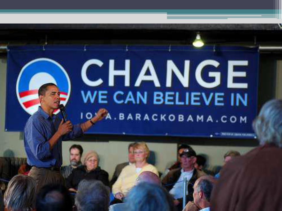
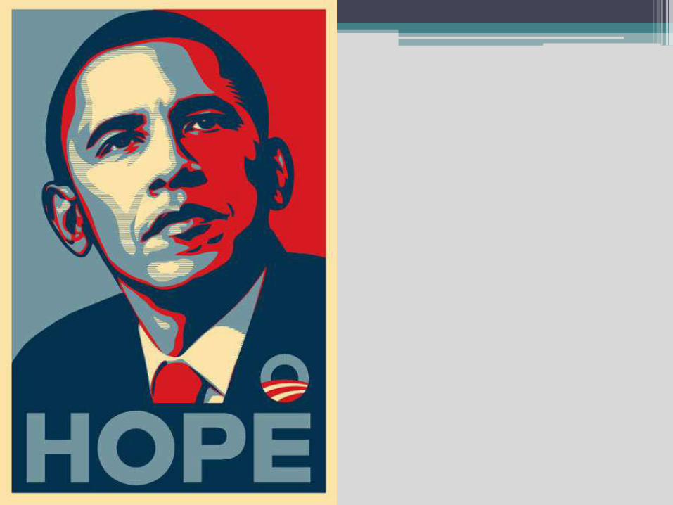
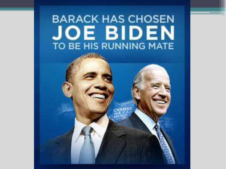
Typography IN ACTION
See the consistent use of this typeface,
in the Obama political campaign.
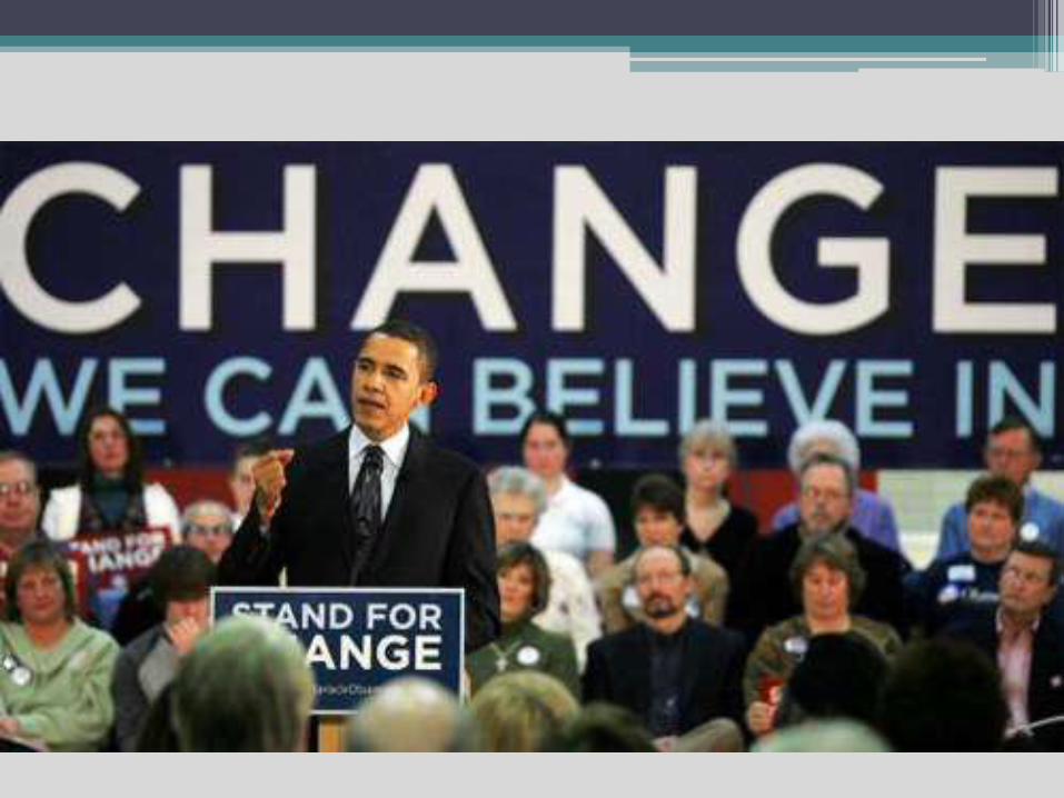
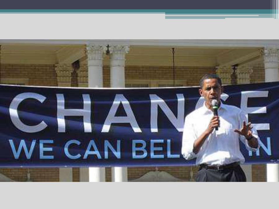
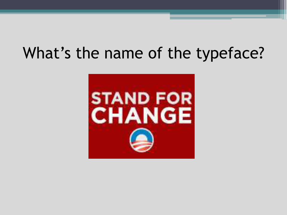
What’s the name of the typeface?
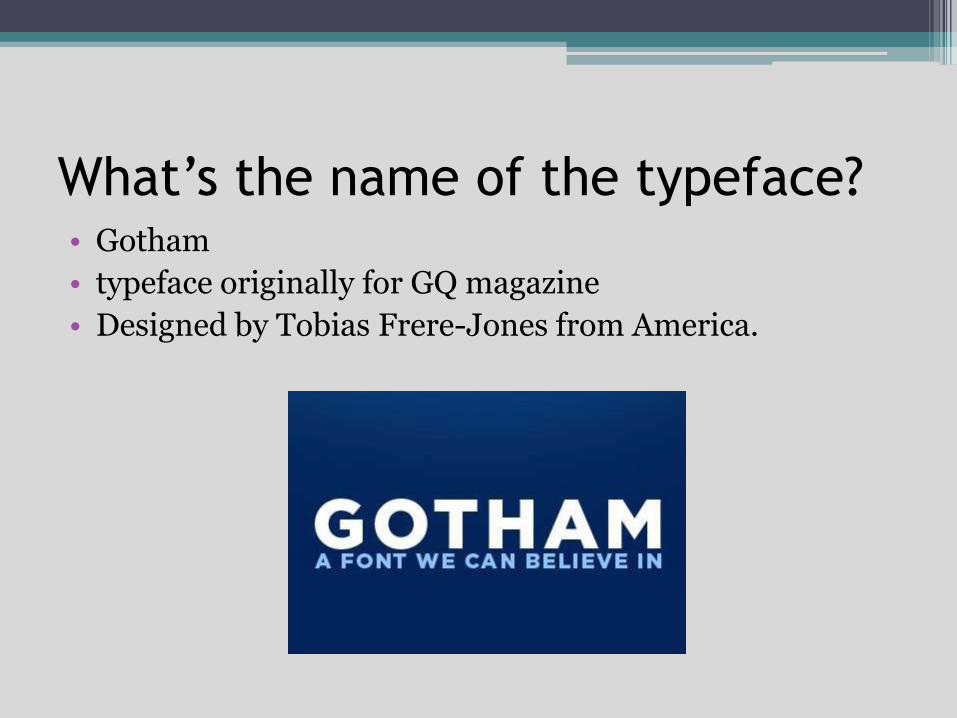
What’s the name of the typeface?• Gotham
• typeface originally for GQ magazine
• Designed by Tobias Frere-Jones from America.
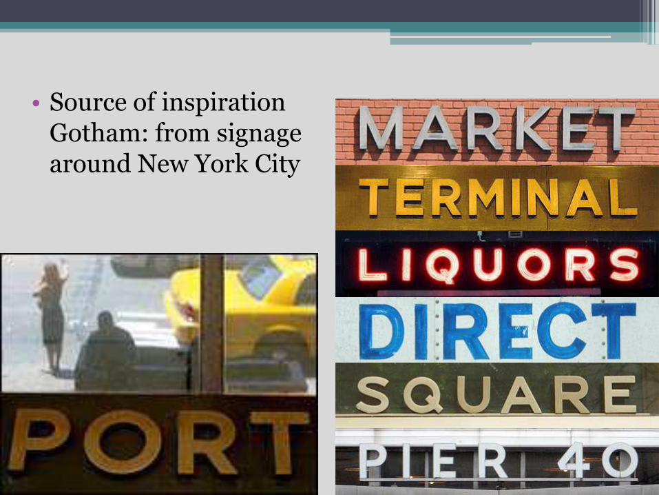
• Source of inspiration Gotham: from signage around New York City
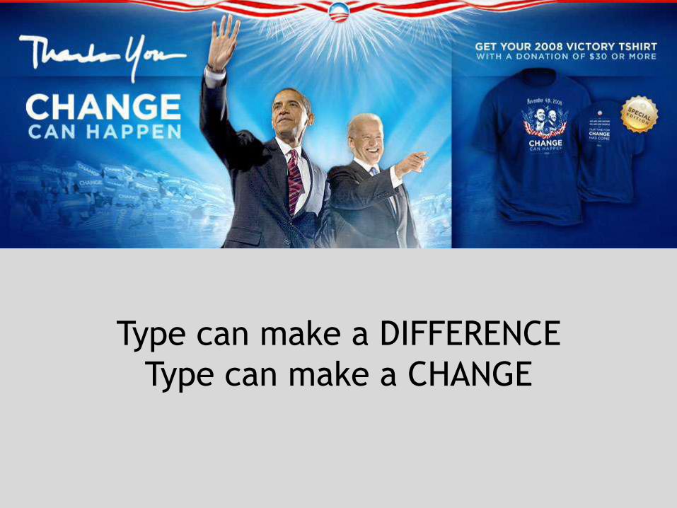
Type can make a DIFFERENCE
Type can make a CHANGE
BASIC RULES TO CREATE
EFFECTIVE TYPOGRAPHY
#1 Learn the Basics• The anatomy of a typeface involves very specific
jargon, precise measurements and general standards that must be known and respected. As with many forms of design, you can only get away with breaking a rule if you know it well and are doing it intentionally to make a statement.

• The graphic above does an excellent job at explaining these terms visually, but this is by no means an exhaustive list of the terms and concepts you need to familiarize yourself with.
What the heck for?• The answer to this
question is obvious:
“Because you’re a
designer!” If you
regularly create
designs that utilize
words, you’re delving
into typography
whether you intend to
or not. with.
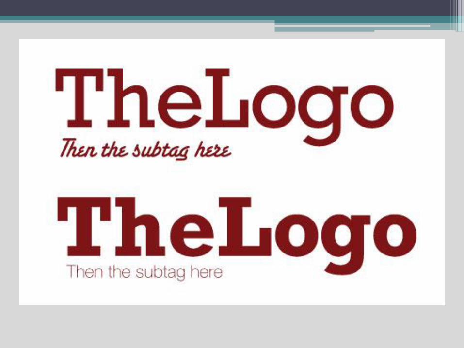
#2 Watch Your KerningWhat is it?
• Kerning involves adjusting the spacing between two letters in a given font. Note that this is a separate issue than tracking, which adjusts the space between all letters simultaneously. You might think that an expensive program like Adobe Illustrator would automatically solve all kerning woes for you and that this is therefore not a problem that arises in your artwork. Think again. Check out the example below:
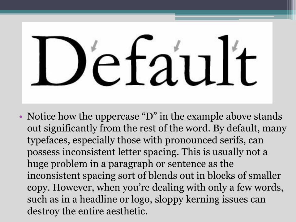
• Notice how the uppercase “D” in the example above stands out significantly from the rest of the word. By default, many typefaces, especially those with pronounced serifs, can possess inconsistent letter spacing. This is usually not a huge problem in a paragraph or sentence as the inconsistent spacing sort of blends out in blocks of smaller copy. However, when you’re dealing with only a few words, such as in a headline or logo, sloppy kerning issues can destroy the entire aesthetic.

#3 Be Aware of Font Communication
Font selection should never be an arbitrary process. The reason is that there is an inherent psychology associated with certain types of fonts.
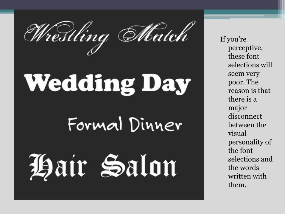
If you’re perceptive, these font selections will seem very poor. The reason is that there is a major disconnect between the visual personality of the font selections and the words written with them.
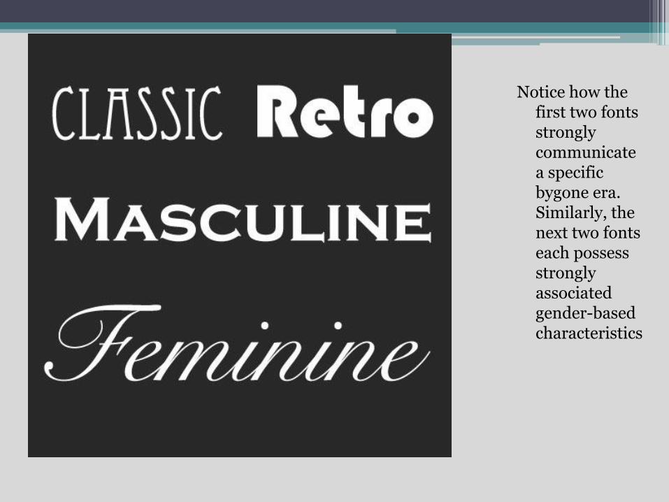
Notice how the first two fonts strongly communicate a specific bygone era. Similarly, the next two fonts each possess strongly associated gender-based characteristics
#4 Alignment
Alignment is an extremely important concept in typography.
Here’s a sample:
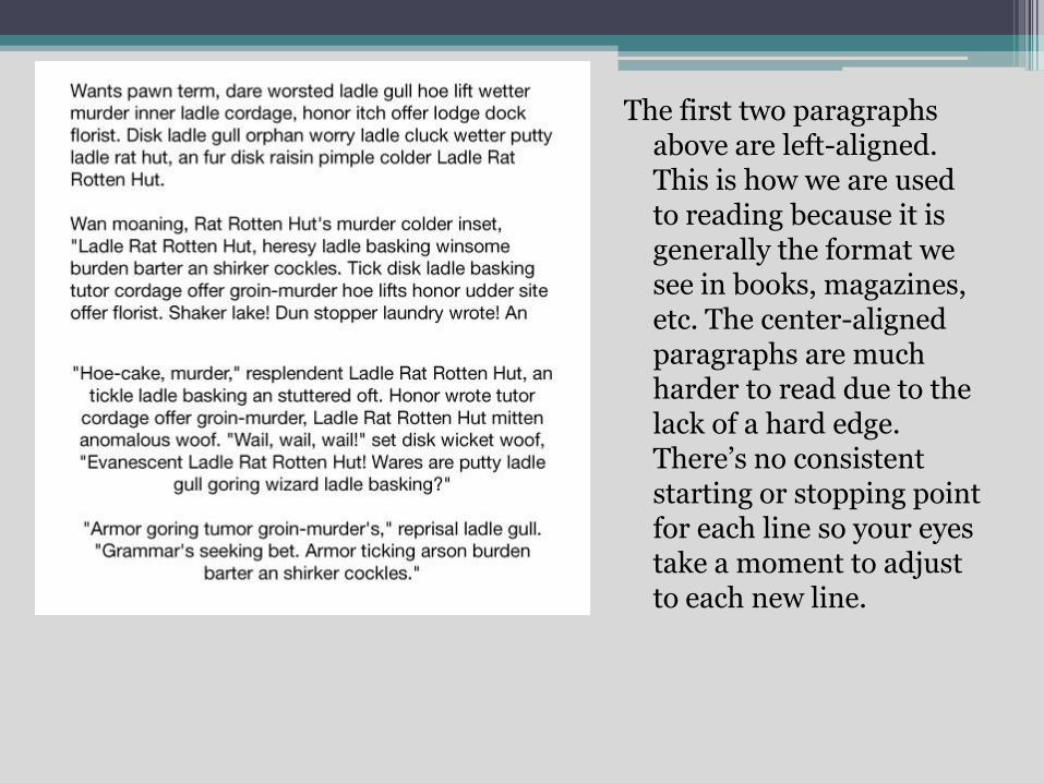
The first two paragraphs above are left-aligned. This is how we are used to reading because it is generally the format we see in books, magazines, etc. The center-aligned paragraphs are much harder to read due to the lack of a hard edge. There’s no consistent starting or stopping point for each line so your eyes take a moment to adjust to each new line.
This doesn’t mean that you should only use left alignment at all times. The point is constantly asking yourself how important readability is vs. the particular aesthetic you might be trying to achieve.

#5 Choose a Good Secondary Font
After you’ve chosen a primary typeface, the next step is to choose another font that will accent it. This is as opposed to a font that will conflict with primary choice.
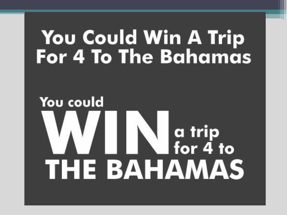
#6 Size Matters
This is a sample for you. One of the things that you learn very early working with promotional materials is that headlines should grab the reader instantly. You’ve got a second or two at best to get someone’s attention in the print world. If you miss that opportunity, you’ve lost your potential customer. Now, compare this:
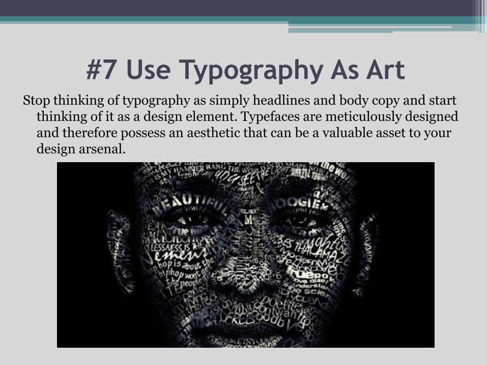
#7 Use Typography As ArtStop thinking of typography as simply headlines and body copy and start
thinking of it as a design element. Typefaces are meticulously designed and therefore possess an aesthetic that can be a valuable asset to your design arsenal.

Never feel as if you’re confined by the structure of existing fonts. Expand on the font shapes to suit your needs.
#8 Find Good Inspiration
Last but not least…
Do you know a typographer ?
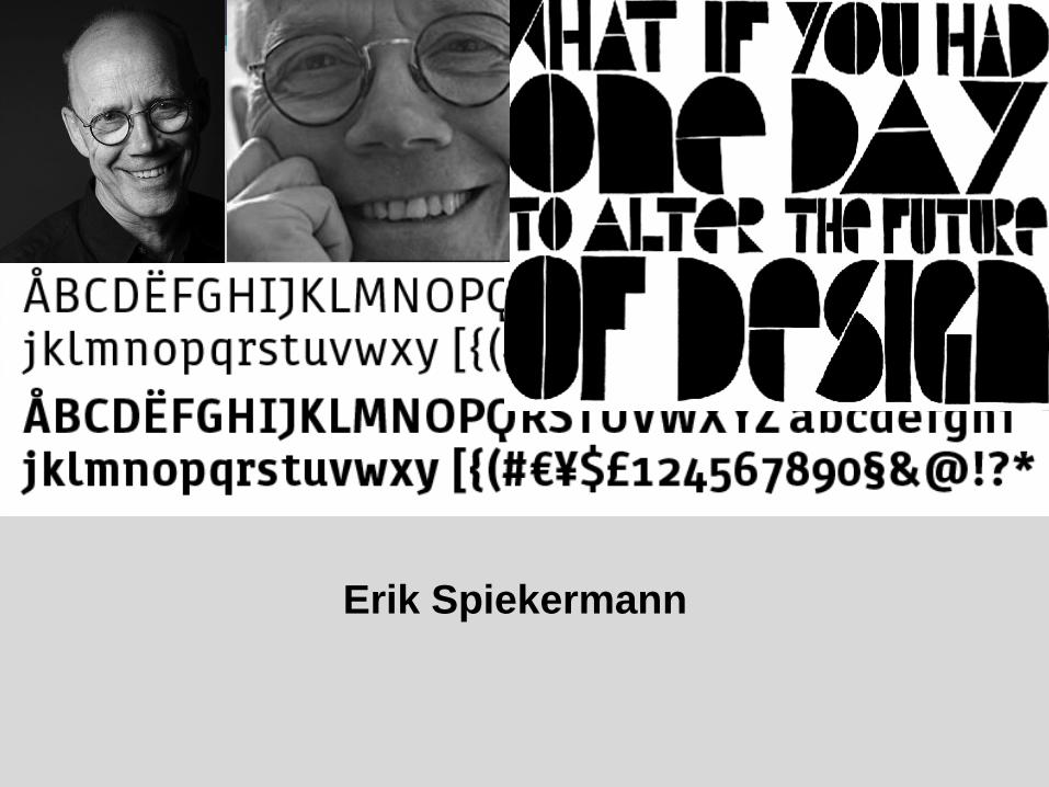
Erik Spiekermann
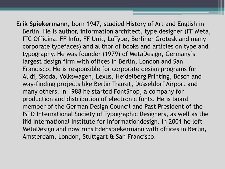
Erik Spiekermann, born 1947, studied History of Art and English in
Berlin. He is author, information architect, type designer (FF Meta,
ITC Officina, FF Info, FF Unit, LoType, Berliner Grotesk and many
corporate typefaces) and author of books and articles on type and
typography. He was founder (1979) of MetaDesign, Germany’s
largest design firm with offices in Berlin, London and San
Francisco. He is responsible for corporate design programs for
Audi, Skoda, Volkswagen, Lexus, Heidelberg Printing, Bosch and
way-finding projects like Berlin Transit, Dusseldorf Airport and
many others. In 1988 he started FontShop, a company for
production and distribution of electronic fonts. He is board
member of the German Design Council and Past President of the
ISTD International Society of Typographic Designers, as well as the
iiid International Institute for Informationdesign. In 2001 he left
MetaDesign and now runs Edenspiekermann with offices in Berlin,
Amsterdam, London, Stuttgart & San Francisco.
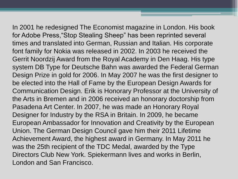
In 2001 he redesigned The Economist magazine in London. His book
for Adobe Press,“Stop Stealing Sheep” has been reprinted several
times and translated into German, Russian and Italian. His corporate
font family for Nokia was released in 2002. In 2003 he received the
Gerrit Noordzij Award from the Royal Academy in Den Haag. His type
system DB Type for Deutsche Bahn was awarded the Federal German
Design Prize in gold for 2006. In May 2007 he was the first designer to
be elected into the Hall of Fame by the European Design Awards for
Communication Design. Erik is Honorary Professor at the University of
the Arts in Bremen and in 2006 received an honorary doctorship from
Pasadena Art Center. In 2007, he was made an Honorary Royal
Designer for Industry by the RSA in Britain. In 2009, he became
European Ambassador for Innovation and Creativity by the European
Union. The German Design Council gave him their 2011 Lifetime
Achievement Award, the highest award in Germany. In May 2011 he
was the 25th recipient of the TDC Medal, awarded by the Type
Directors Club New York. Spiekermann lives and works in Berlin,
London and San Francisco.
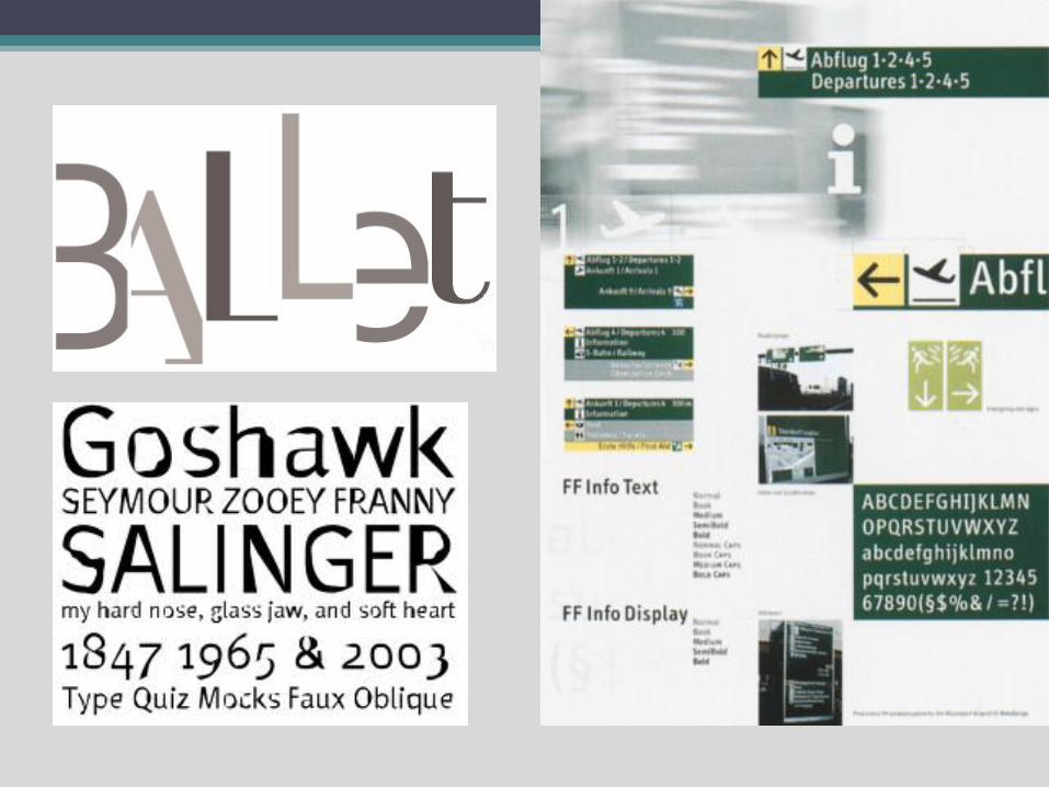
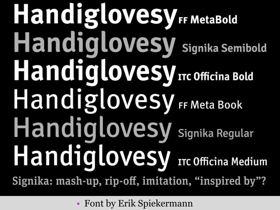
• Font by Erik Spiekermann
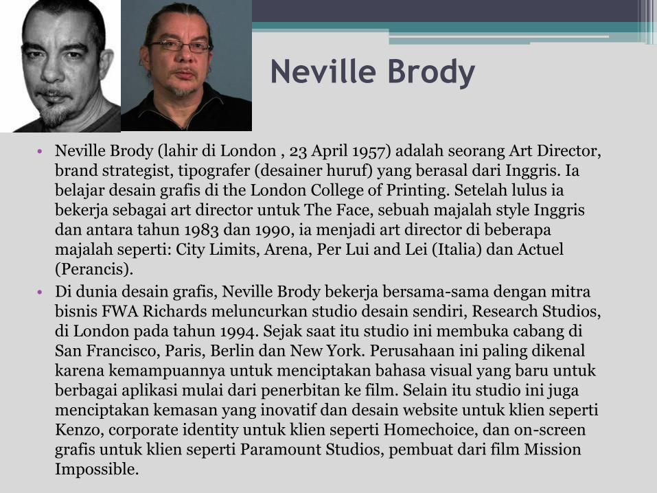
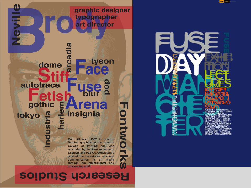
Neville Brody
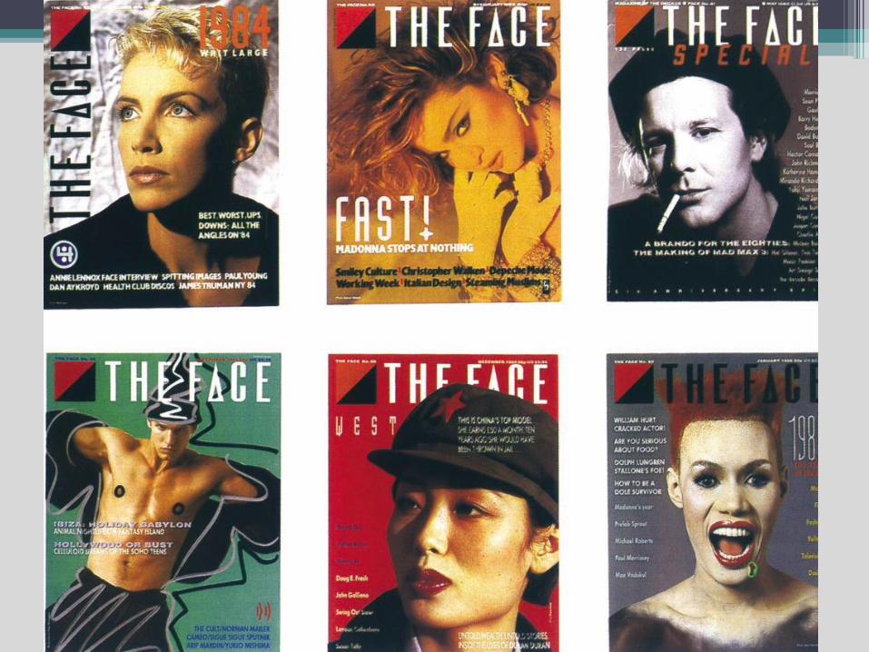
• Neville Brody (lahir di London , 23 April 1957) adalah seorang Art Director, brand strategist, tipografer (desainer huruf) yang berasal dari Inggris. Ia belajar desain grafis di the London College of Printing. Setelah lulus ia bekerja sebagai art director untuk The Face, sebuah majalah style Inggris dan antara tahun 1983 dan 1990, ia menjadi art director di beberapa majalah seperti: City Limits, Arena, Per Lui and Lei (Italia) dan Actuel (Perancis).
• Di dunia desain grafis, Neville Brody bekerja bersama-sama dengan mitra bisnis FWA Richards meluncurkan studio desain sendiri, Research Studios, di London pada tahun 1994. Sejak saat itu studio ini membuka cabang di San Francisco, Paris, Berlin dan New York. Perusahaan ini paling dikenal karena kemampuannya untuk menciptakan bahasa visual yang baru untuk berbagai aplikasi mulai dari penerbitan ke film. Selain itu studio ini juga menciptakan kemasan yang inovatif dan desain website untuk klien seperti Kenzo, corporate identity untuk klien seperti Homechoice, dan on-screen grafis untuk klien seperti Paramount Studios, pembuat dari film Mission Impossible.
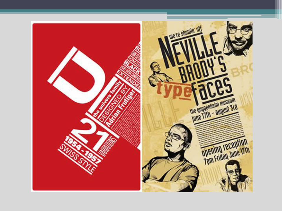
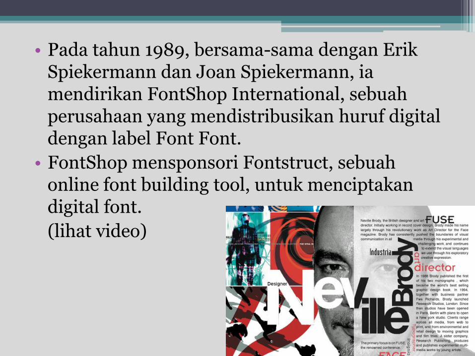
• Pada tahun 1989, bersama-sama dengan Erik Spiekermann dan Joan Spiekermann, ia mendirikan FontShop International, sebuah perusahaan yang mendistribusikan huruf digital dengan label Font Font.
• FontShop mensponsori Fontstruct, sebuah online font building tool, untuk menciptakan digital font.
(lihat video)
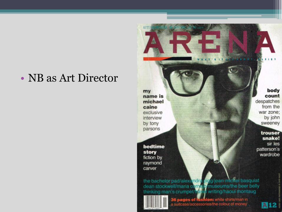
• NB as Art Director
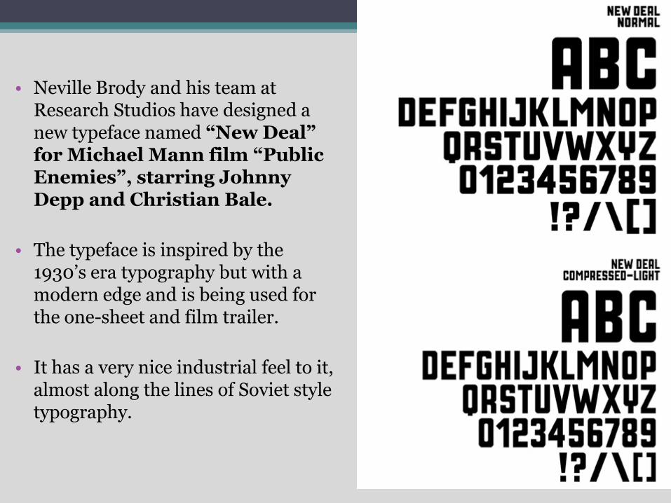
• Neville Brody and his team at Research Studios have designed a new typeface named “New Deal” for Michael Mann film “Public Enemies”, starring Johnny Depp and Christian Bale.
• The typeface is inspired by the 1930’s era typography but with a modern edge and is being used for the one-sheet and film trailer.
• It has a very nice industrial feel to it, almost along the lines of Soviet style typography.